Yammer is an enterprise social networking service used for private communication within organizations.
It is free to use indefinitely, but companies must pay license fees if they want access to administrative
controls, including integration with user management systems like ActiveDirectory.
This is a relatively small dataset, with more than 34,000 rows of records and 5 tables, such as experience, event, emails, and users.
Problem: Drop in User Engagement
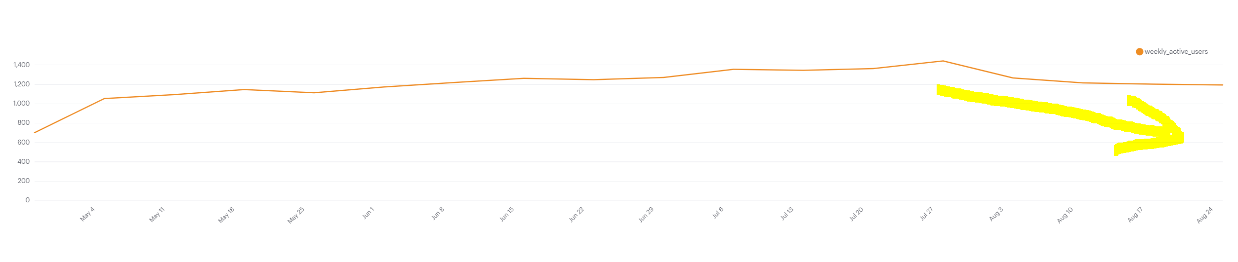
The below chart shows the number of engaged users each week.
Yammer defines engagement as having made some type of server call by interacting with the product (shown in the data as events of type "engagement"). Any point in this chart can be interpreted as "the number of users who logged at least one engagement event during the week starting on that date."
I tried to find out what caused the dip at the end of the chart shown below.
Hypotheses
There are many possible
reasons that could cause the drop in user engagement. 1. Some technical issues resulted that
users couldn't use the app. 2. A major marketing event caused a spike before and then the user engagement
dropped back to the normal level.
Before I test my hypotheses, Understanding why the database is built in this way is very important.
This database is in third normal form and user id is the primary key, so I decided to check users'
activities in my first step.
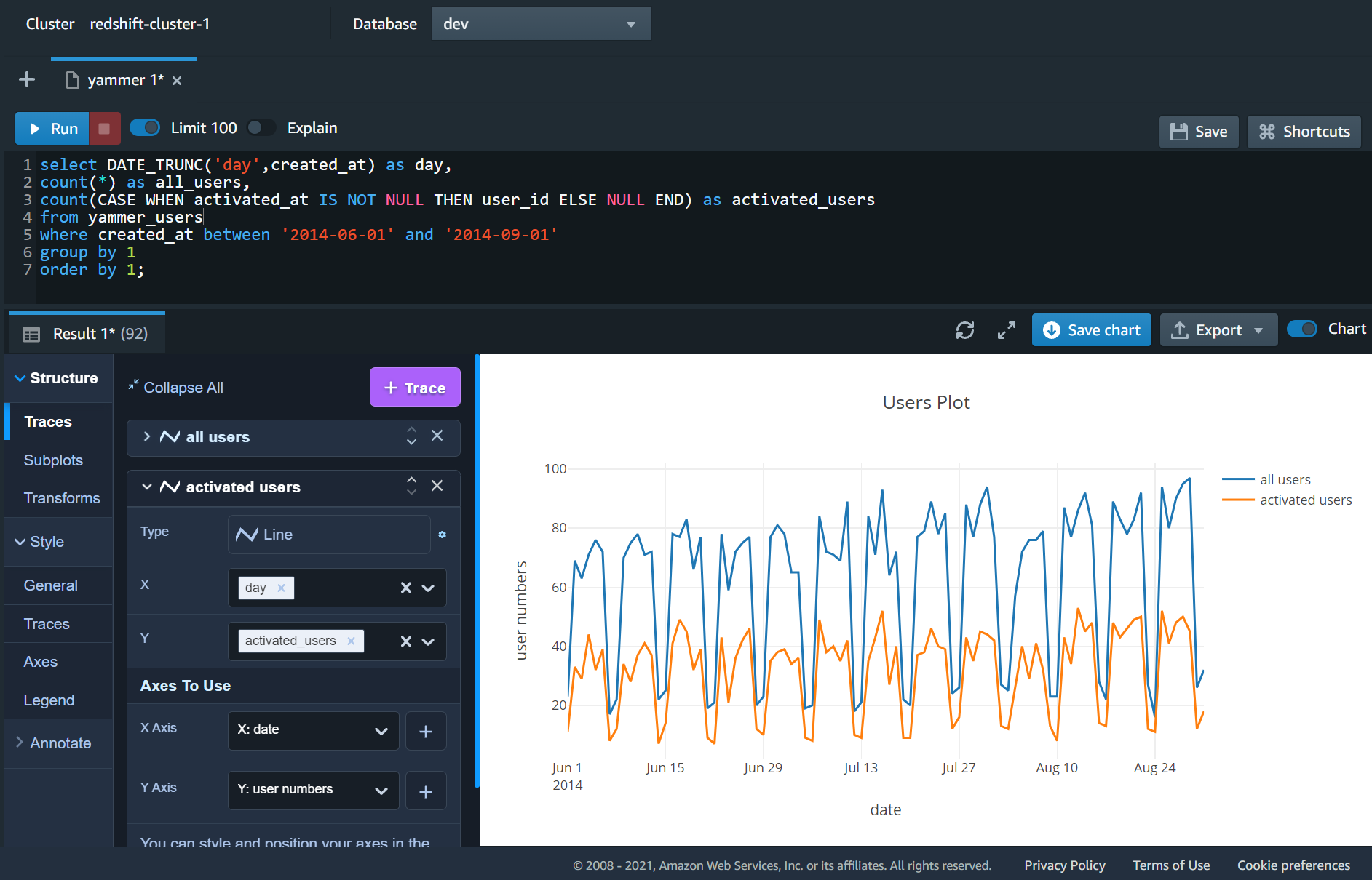
Users' Activities
I used the following sql query to check all users and new users numbers every day.
In Redshift, I could quickly generate a graph to see if there's a downward trend in recent weeks.
It looks like users' numbers are stable, so this is not the reason that causes a drop in engagement.
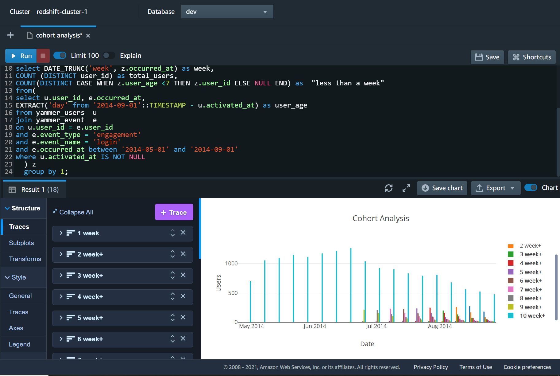
Cohort Analysis
Since the growth rate was stable, I'd like to do cohort analysis.
Splitting the users into cohort groups, we can see that our old users' (10+ weeks) engagement was decreasing over the last few weeks. Then I need to find out that
why our retention rate is declining.
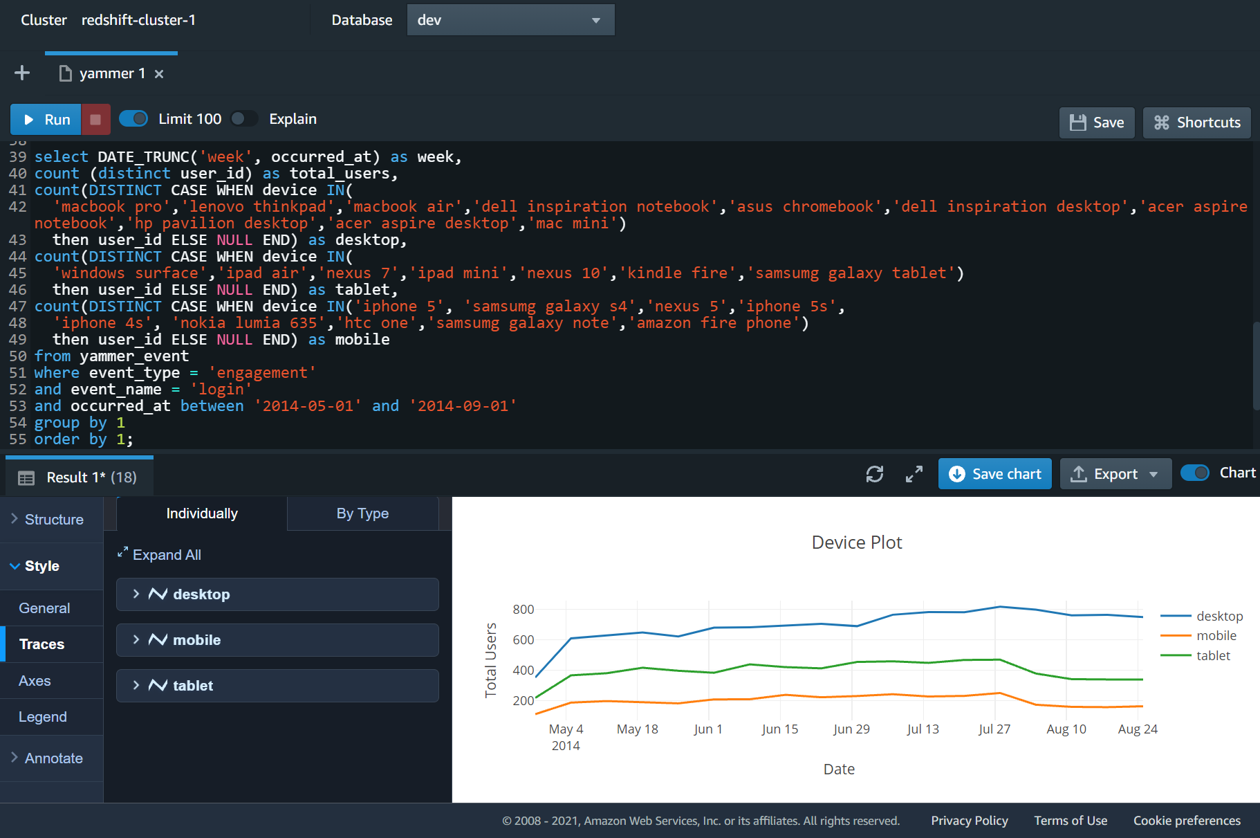
Device Analysis
I checked the device plot. Desktop users' engagement is stable, but engagement in mobile and tablet has decreased significantly. It looks like that the app has some technical issues
on mobiles and tablets.
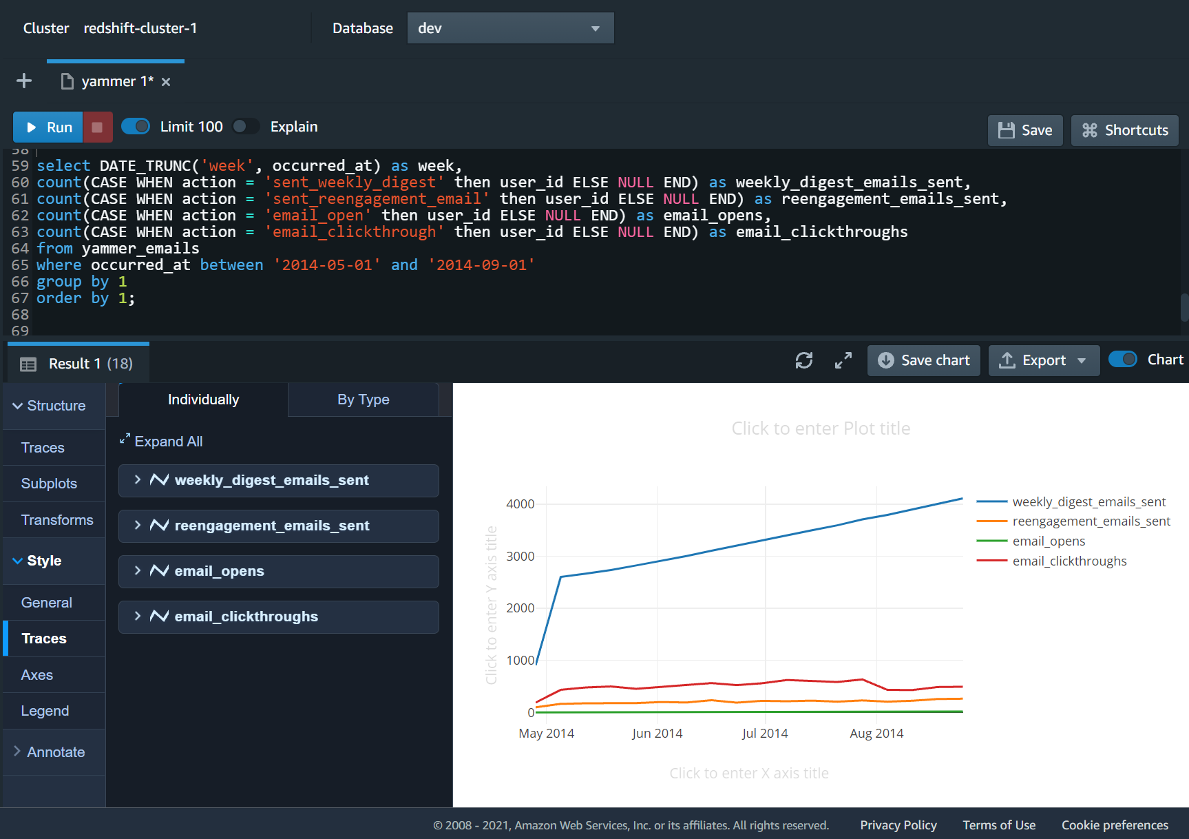
Email Analysis
The purpose of the digest email is to bring users back into the product.
It looks like email marketing has some problems, so I check different types
of email marketing. After viewing the chart, I found the key issue. The click-through rate dropped significantly. There must be something wrong with the newsletter.
In conclusion, based on the current data, I still don't know what the real problem is,
but I narrowed it down to the email marketing. This analysis could save the company a lot
of time to find the problem.