Home
About
Portfolio
Projects
Contact
Let's Talk
Home
-
Tableau Showcase
Here are some of my Tableau examples. I use Tableau during the data exploration and reporting stages. It's a very powerful tool for me to create worksheets and dashboards. Parameters and filters are useful to create interaction. Also, I use its data interpreter if my dataset is unorganized. I also use it to pivot or split my data. These worksheets and dashboards were published on Tableau Public and were embedded on my website. You can see some interactive worksheets and dashboards here and try them by yourself.
Startup Company Clustering Case
In this case, I was trying to solve several problems for this startup company. The company decided to expand its stores, and it can't compete with big players in big cities, so it wanted to build a vast network in the smaller cities. The company has two separate sales regions.
Here are the problems:
1. Find the average revenue per city.
2. Find the average marketing spending per city.
3. Find the average ROI per city.
4.Identify which of the two sales regions is performing better.
4.Identify which of the 10 new locations have the best potential for the company to invest more funds into marketing.
I used the group function to create two customer territories for each region, creating average revenue, average marketing spend, and average ROI. Then I used the highlight function to identify new and old stores. Tableau has an embedded cluster function (K-means model) in its analytics tools, so I just used this very powerful tool to cluster the stores which performed differently.
To identify which of the cities are the best to expand the store, I used inner join to connect another dataset which is the U.S. population dataset. After I combined the population information into the cluster analysis, Tableau created three clusters by default. Then I added some trend lines (linear regression model) to the graph so that I could determine which new stores have the best potential for the company.
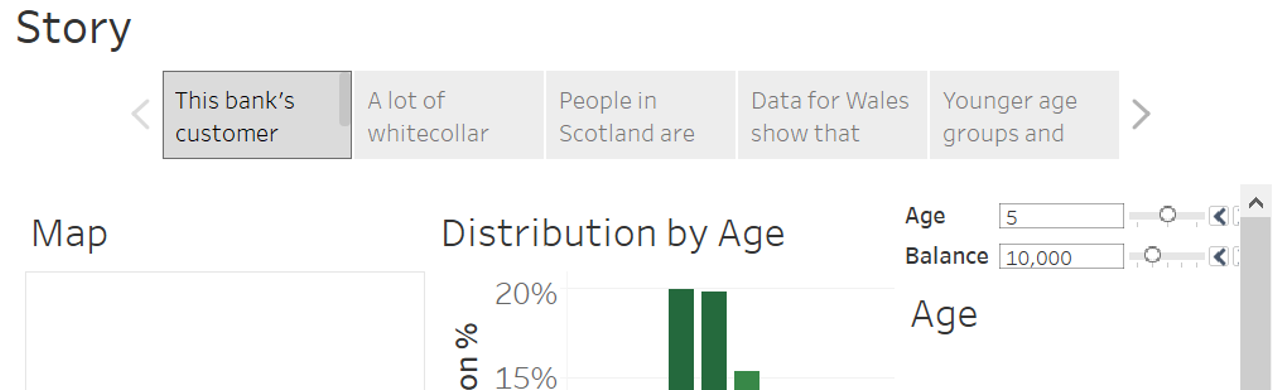
UK Bank Segmentation Case
This is a UK bank dataset. Customers are from England, Wales, North Ireland and Scotland. It's a customer segmentation dashboard, and you can use each worksheet as a filter. If you click on England, then you'll see all the information about England.
I also created a story in Tableau to tell my audiences some meaningful findings.
1. This bank's customer baseline.
2. A lot of white-collar workers are located in England.
3. People in Scotland are mostly blue-collar workers and they are older, about 64%.
4. Data for Wales show that people in Wales are above average representation of mid-sized balances.
5. Younger age groups and female customers are in Scotland.
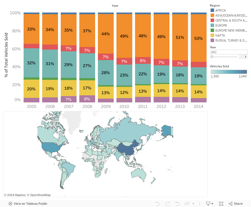
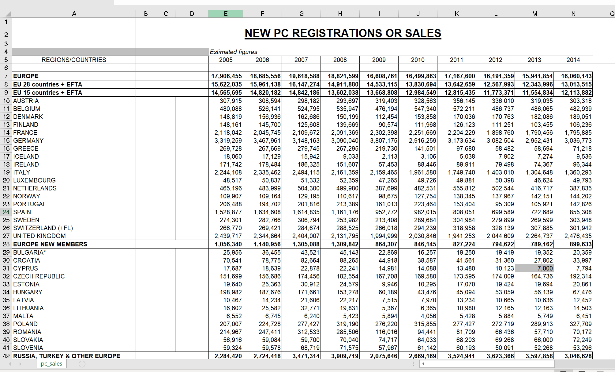
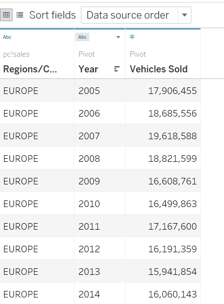
Vehicles Dashboard
This dataset was very unorganized. I used Tableau data interpreter to clean and pivot the dataset.
Original dataset in Excel
Cleaned dataset in Tableau
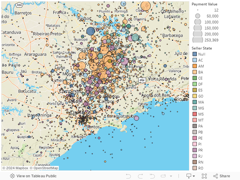
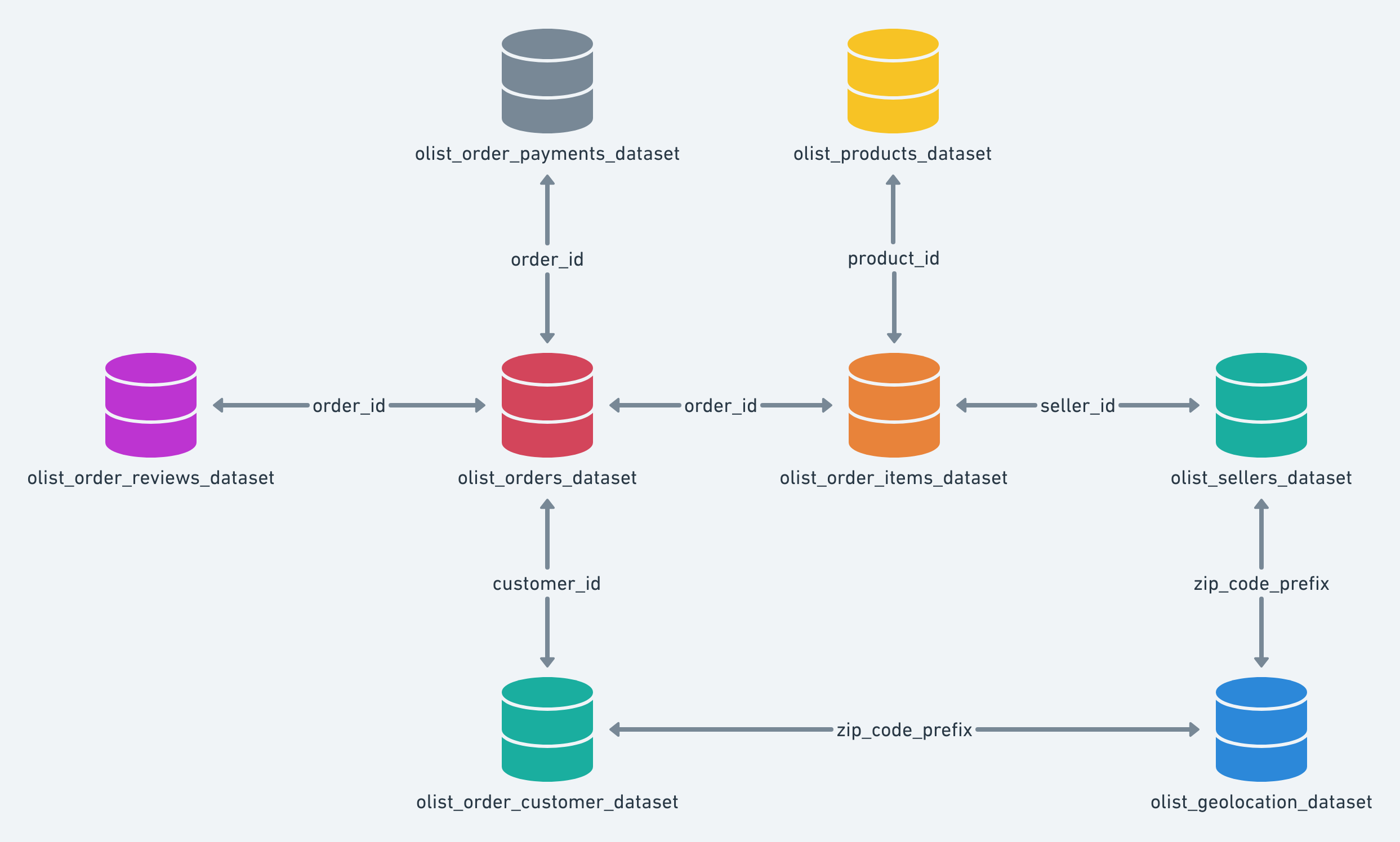
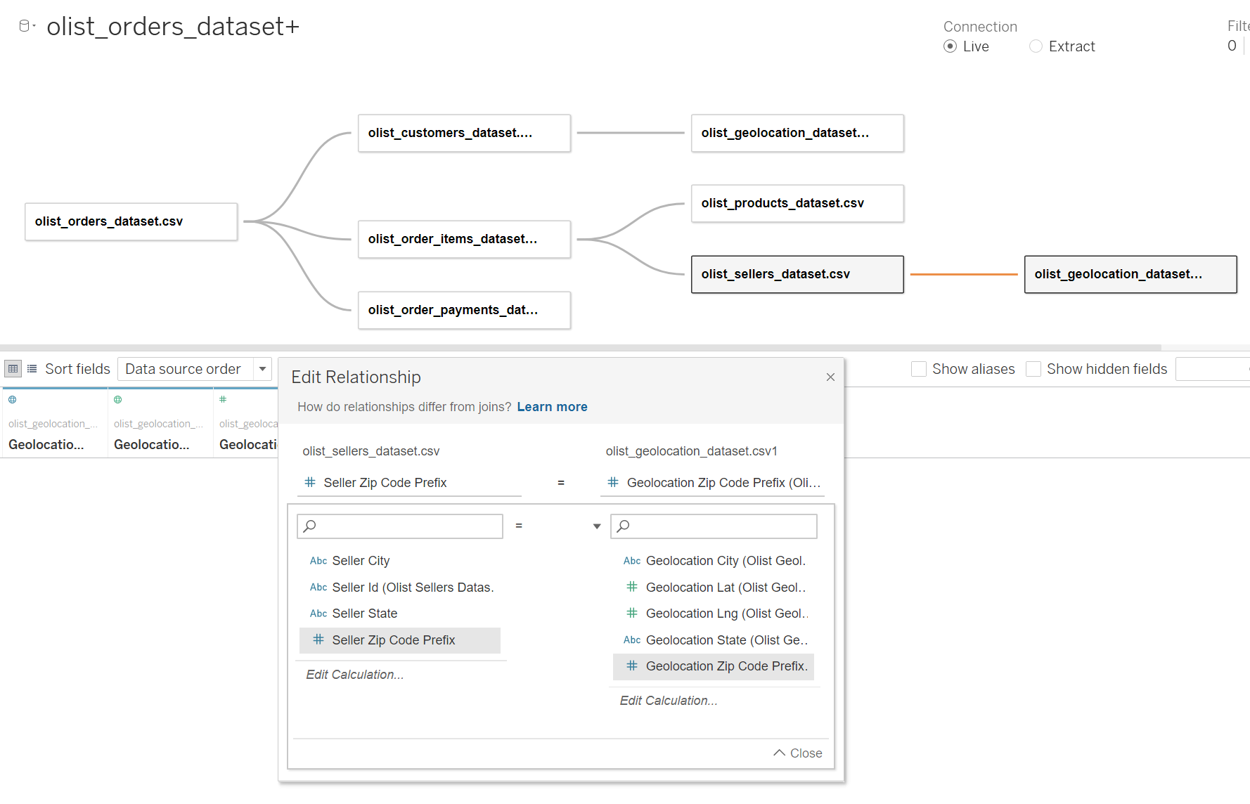
Brazilian E-Commerce Sales Data Model
This is a Brazilian E-Commerce Sales dataset. The bubbles show the sales in each zip code area. To create this visual map, I connected 8 datasets and created a data model. You can view sellers in different states and each state has its own color.
This is the data schema sketch map , so I followed this data model to recreate this model in Tableau.
It's different from data joining or data blending. I just created relationships among these datasets.
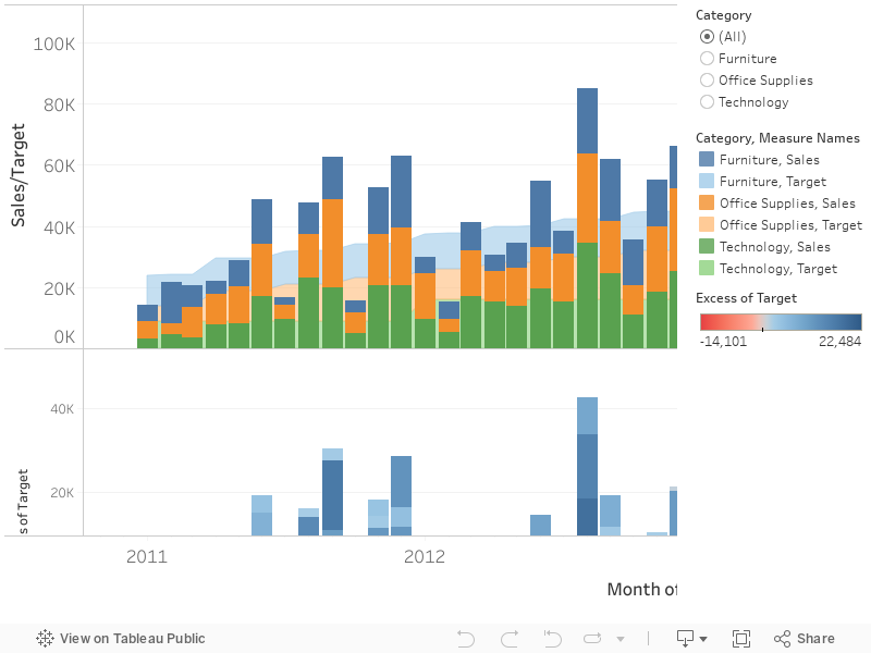
Sales/Target for Each Category
There are three Excel sheets. I used inner join to connect the first two datasets. The third dataset is the sales target for each category. I created a dual-axis chart and combined the actual sales and target sales together. Also, to make a simple chart, I used filter to create this interactive bar chart so that people could see what they want to see.
Sales Profits in Europe
This is an interactive dashboard about a company's profit margins in Europe from 2011 to 2014. You can choose to view all years' profit margins or a single year's profit margins in the right pane. Also, if you select one country, the customer scatter plot will show you each customer's profit margins in that country.
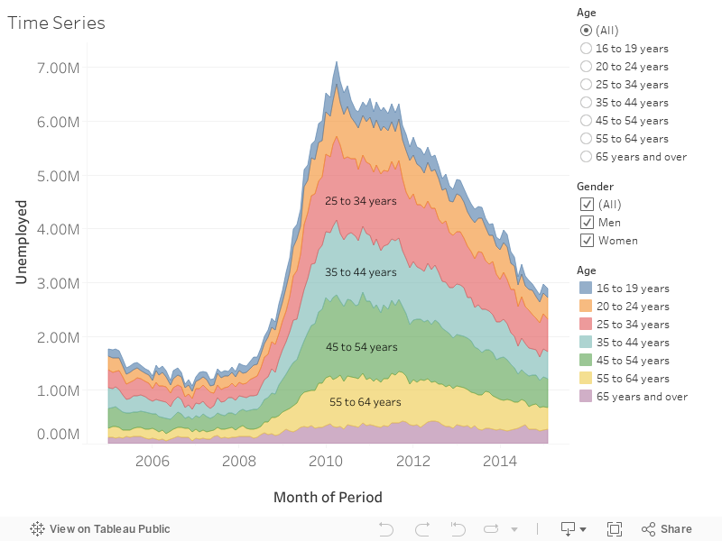
U.S. Unemployment Area Chart
This is an area chart of the U.S. unemployment population since 2005. I created some filters to create this interactive area chart. You can select different age groups and genders to see specific area charts.
WeChat
×
Wechat ID:
jasonfangmagic
Email
×
jasonfangworks@gmail.com
Phone
×
301-633-5387