- Home
- -
- Matplotlib & Seaborn Showcase


Here are some of my Matplotlib and Seaborn examples. I usually use Tableau during the data exploration and reporting stages.
However, Matplotlib and Seaborn are also very useful when I write Python code.
I use Matplotlib and Seaborn to generate kernel density estimation plots, pie charts, box plots, and so on.
While only generating correct plots is not enough. I do care about the style and color of my plots.
Most data scientists try their best to do data cleaning and to create perfect models, then they don't really care
about their visuals and reports. I believe creating attractive visuals is the last mile of your analysis and it's the most important
part of your work. Analyzing data is not just for yourself. You need to tell others about your findings and communicate
with others. Some of your audiences even don't know how to code and don't care about your dedicated process.
They care about your visuals. That's why I'd like to spend some extra time creating more attractive plots.
Movie Dataset
This is a movie dataset that contains critics ratings, audience ratings, genres, budget, and Year of release.
I used several plots to generate some meaningful findings by using kernel density estimation, boxplot, violin plot, stacked histogram, and so on.
These plots are not just one line of code. I designed these plots by choosing the best colors, fonts, and so on.
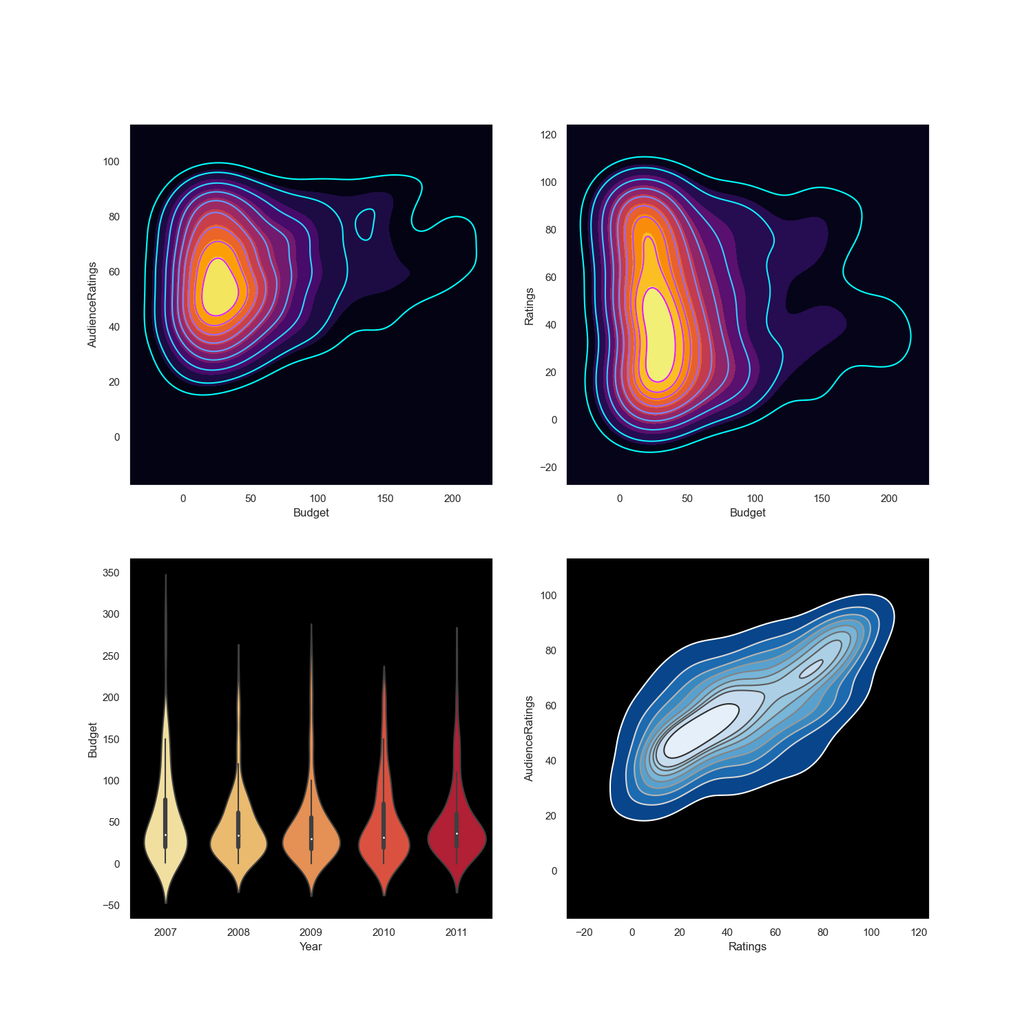
I used the subplot to combine three KDE plots and one violin plot to create this dashboard.
To make this dashboard more attractive. I chose to use a black background with some appealing colors.
Also, for the KDE plot, I created two plots and combined them together to make clearer borders.
Then I used inferno and cool colors and adjusted the axes. Drawing plots in Python is not as easy as in Tableau, but
Matplotlib and Seaborn are very powerful tools as well.
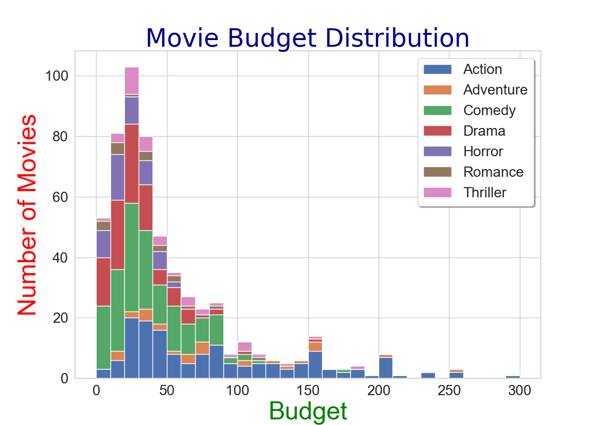
This is a stacked histogram plot. It shows the movies budget distribution across
different genres. While it's not just a simple histogram. As you can see from my code,
I wrote a For loop to create all the results and then
I delicately chose the font size,
legend background, size of the plot, x and y ticks label size, and so on.
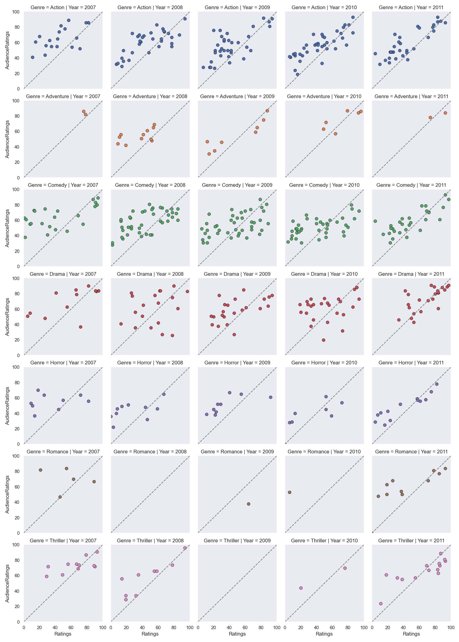
This is a facet grid plot. You can the difference between audiences and critics ratings
for different genres in different years. I also wrote a For loop to draw a diagonal line in each graph
so that my audience could easily see the difference between the two groups.
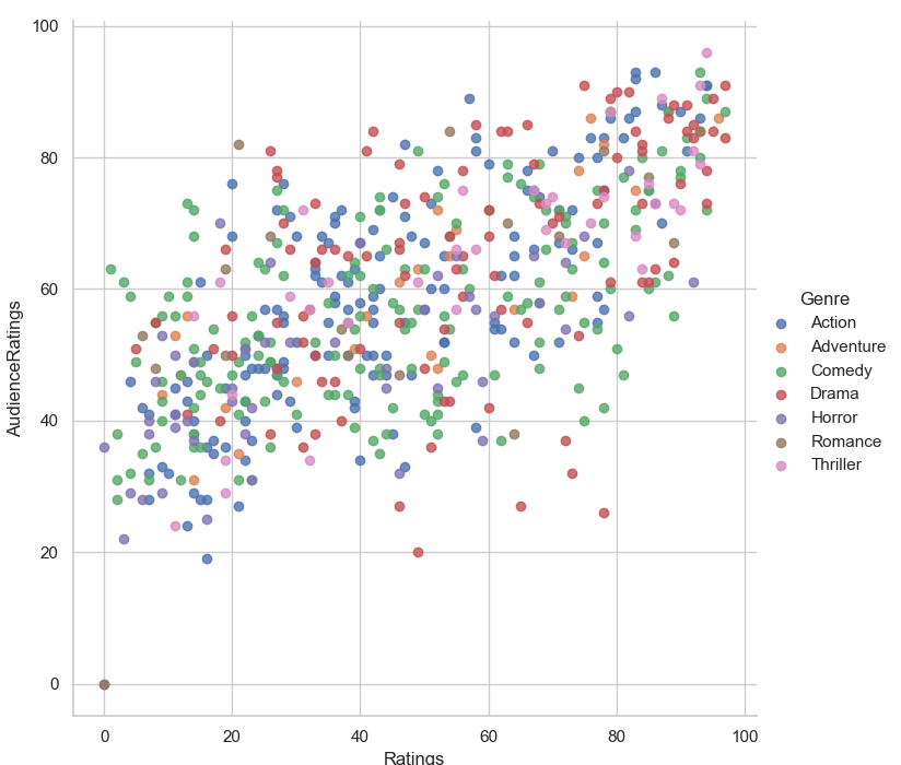
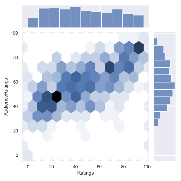
These are scatter plot and joint plot with hexbin. Always trying different kinds of plots is an important
job for data scientists.
Wechat ID:
jasonfangmagic